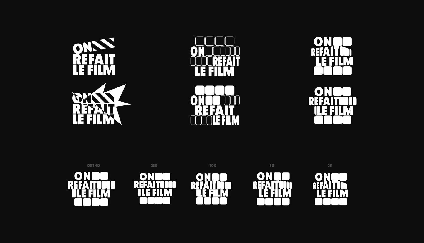
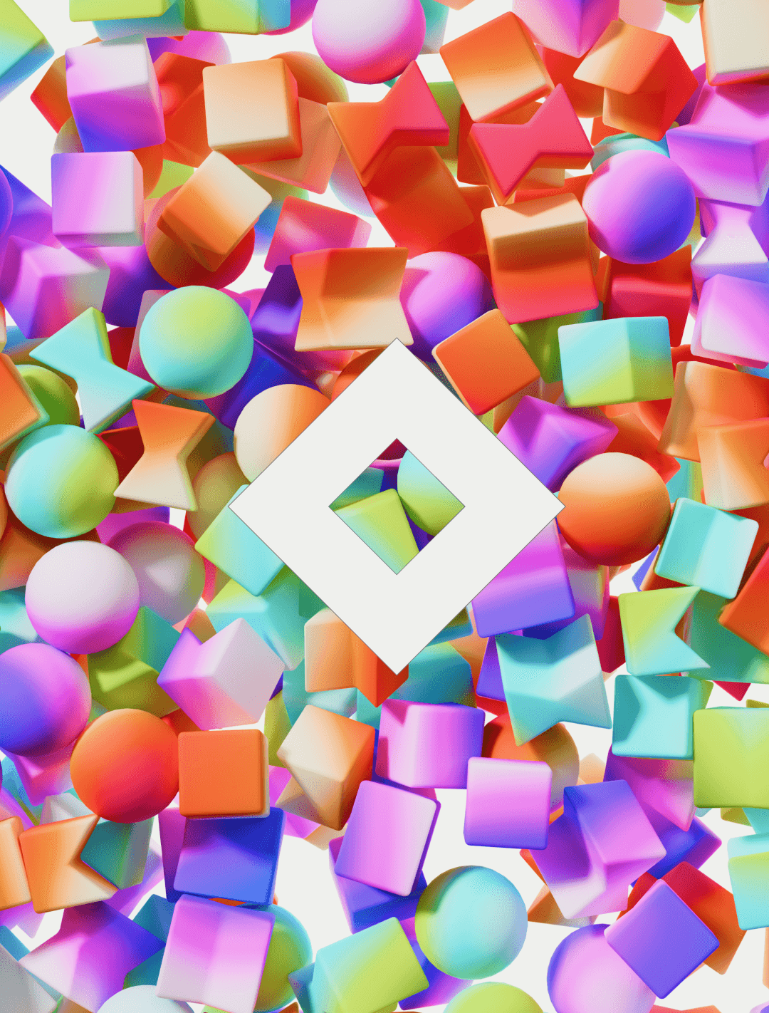
Aurélien Préveaux is a French YouTuber, writer and director known for absurd, offbeat humor. The new concept, On Refait le Film, redubs iconic movie scenes to tell a different story through voice alone. I designed the logo and its animation.
Aurélien came with a clear direction: a Rubik's cube, a symbol of remixing and reassembling. I turned the cube into a graphic logo, then built the animation on the same idea. The logo assembles itself on screen, like a scene being rewritten. I worked in Blender and Cavalry.